Rustlr – where goes my internet traffic?
So, the first question on your mind is likely to be what on earth is Rustlr? And indeed, the name can do with a little bit of explaining.
Similar to how a rustler is someone who rounds up and steals sheep or cattle, our browser plugin Rustlr rounds up and visualises data sent from your browser as you surf the internet. It also (among other things!) tries to alert you of other suspected rustlers out there who may be trying to steal your data. Admittedly the link is slightly tenuous, but it makes for a cool sheep icon, a name that rolls of the tongue, and nods towards our west-country location!
The intention behind Rustlr was twofold: For the user, we wanted to provide a way of increasing their awareness of their security footprint while browsing the web. Whereas we, as a group of developers, wanted to try our hand at making an internet plugin. We wanted to focus on usability and make it easily accessible to those who were not necessarily ‘techies’ or internet security experts.

How it Works
The extension captures HTTP traffic sent from the browser, runs processing on each request to generate a set of alerts, and then displays the results on a map of the world.
The processing step resolves the IP from the hostname, and then uses the Maxmind GeoIP database to find the location the request originated from. It then runs a set of rules on each request, checking for things that look a little suspicious such as the request origin being on a known blacklist, or a password being sent to an unexpected domain. Finally, it sends the resulting set of alerts along with the request to the visualisation layer.

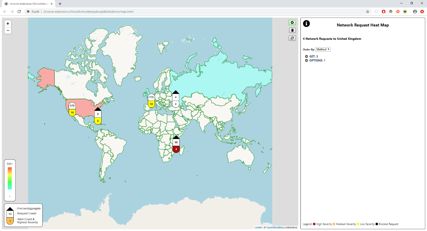
The main visualisation shows a heatmap of the world, built from the count of requests sent to each country, which quickly gives a picture of where data is going. For instance, an unexpected country lighting up when browsing a known website could be an indicator that something odd is going on!
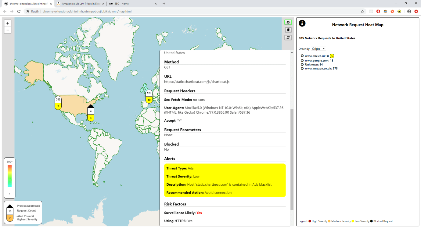
From here the user can drill into the requests sent to each place. They can view request data that an experienced developer may be able to find through Dev Tools. Or they can skip straight to viewing the alerts, which highlight potentially dangerous activity. The icon changes colour as the alerts rack up that, alongside pushed browser notifications, warn the user even when the map is not in view!

Technology Stack
Writing a browser extension, we were tied to using the web development technologies – JavaScript, HTML and CSS. However, we did have room to make a few decisions. We decided to use TypeScript, for all the benefits that it brings, notably reliability and readability.
While the extension API prescribed the structure of the built package, we wanted flexibility in structuring our code. So, we used Webpack to convert our source into the modules that the browser required. We used the browser Web Storage API for persistence to ensure that the whole system could be packaged and loaded in without any external dependencies.
We discussed the idea of using a framework such as Angular or React but decided against it to reduce boilerplate and to avoid introducing another technology into the mix that would have to play nice with the others.
We decided to support both Chrome and Firefox, which can often throw up challenges due to the subtle differences in their APIs. However, we mitigated this by finding a polyfill library that enabled us code against just one common API.
Our main third-party dependency was the open-source mapping library Leaflet which we used for our main visual element. We found it straightforward to use and some of the additional features developed by the open source particularly suited our needs.
Our Development Process
We kicked this off in a team of four and run this as an internal ‘Capability Development’ project. We worked in one-week sprints following the Agile Scrum Framework, albeit a slightly relaxed one, so that we could incrementally build up a more sophisticated solution, while maintaining some focus on the end user.
At the end of each sprint, we demoed to our senior engineering team, who were acting as the customer. One of them played the role of the Product Owner to prioritise our backlog and give us steer in terms of features.
After an initial phase of development of around a month, we had laid down the core structure and implemented many of the initially desired features. This meant that subsequently, it was easy for new developers to pick up the project quickly and slot in their new feature in the established architecture.
UX Journey
In terms of user experience, we began by gathering a high-level idea of what the extension should do from our group of ‘customers’, and how this could be useful. We quickly determined that the plugin should have a visual element, be easy to install and use, and highlight the most interesting information first. As we started developing and receiving feedback, we went on a journey that significantly changed the structure of the app.
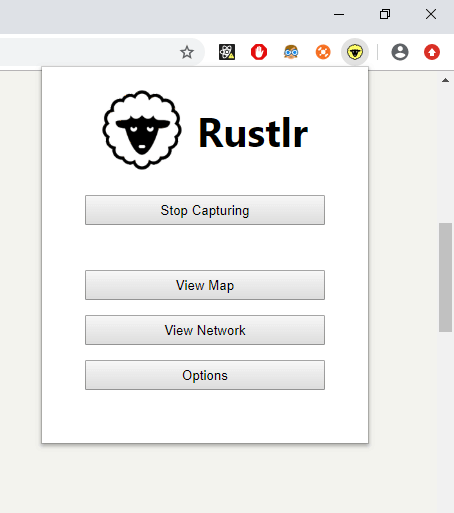
A good example of this is that initially we went for a design that popped out the extension in a separate window, and then all further controls were operated from that window. This was seemingly a simple design but it went against the normal convention that browser extensions use – to display a control panel popup below the icon next to the address bar. It was also found to be cumbersome to have to always keep an extra window hanging about while browsing.
Following user feedback during each sprint, we restructured the extension to fit the common pattern, meaning that it would behave as the user expected on their first use, a principal that is at the core of user-centric design!

Final Thoughts
We found that using the Agile development process helped us to stay focussed on the most important features. It enabled us to react spontaneously and change the direction the extension was going in after receiving feedback. It also allowed us to delay some design decisions to when we had a better understanding, instead of trying to guess up-front.
All too often when developing we become over familiar with our product and lose sight of the user’s experience. Sticking to user-centric principles when designing helped us to tackle this to an extent. However, putting our extension in front of someone outside the development team was even more valuable.
We developed using all open-source products, so were very grateful of the strength of the open-source community. It also goes to show that putting together the right mixture of technologies can go a long way.
All in all, we developed an extension that is easy to use, provides useful security information and fits our initial aims!